Do you ever see someone’s website and your mind suddenly goes like: ‘Woah! This looks absolutely stunning! I cannot take my eyes off this site!’.
Because I do.
If a site is well-designed with a great color theme, adorable fonts and overall branding, you can’t help but check out the nooks and crannies of that site for hours. (Uhm…..speaking from experience)
In this humungous world of blogging, you’ll hear fifty different tips from 100 different creators and most of them emphasize on one thing: “CONTENT IS KING”.
You may have heard this quote at least once after starting your blogging journey and while it is the most important thing to focus on, what most people don’t talk about is the design and functioning of your site.
Ok let me explain more…..
One day, I found your blog through Pinterest and decided to take a look at the content you’re offering to me (your audience). I read through your whole posts and the content is S tier (yayyy) but there’s one thing I cannot seem to like. That’d be the design of your site.
There’s no monotony, I can’t find my way around it, the font is so complex to make out, the color palette seems out of touch, and it takes a lot of time to load up images. IT’S A HUGE MESS!!!
Can you guess what would be my next step?
I take the cursor of my mouse towards the ‘close’ button of my computer and may never return back to your site, ever again.
And this is not just an imaginary situation. I’ve done this quite a lot of times whenever I visit some not-so-nicely designed blog for the first time.
I have also rebranded my site because the previous branding and design were so bad. It was a mess, both design-wise and functionality-wise. I come from my past mistakes and experiences to talk about this topic and I want your blog to shine in this competitive market.
So in this post, we’ll be discussing how to design blog/website, what makes a good design which tool to use for designing, and a free branding kit that you can use for the branding/rebranding of your blog.
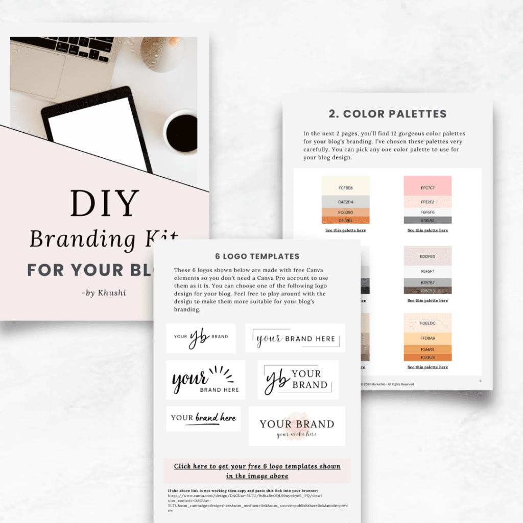
You can download the Branding Kit from here and start designing your blog. Please know that you’ll also be subscribed to my newsletter after receiving this branding kit.
Let’s jump to some fun stuff, shall we?
Some links in this post are affiliate links. If you purchase through these links, I earn a commission at no extra cost to you. I only recommend products, tools and services that I trust. For more information, read the full disclosure here.
- NAILING THE BLOG DESIGN THAT PEOPLE WOULD LOVE!
- WHICH TOOLS TO USE TO START DESIGNING?
- 12 TIPS ON HOW TO DESIGN BLOG/WEBSITE TO IMPRESS YOUR READERS
- 1. CHOOSE A GOOD THEME
- 2. SIMPLE, CLEAR AND NEAT FONTS
- 3. DESIGN THE PERFECT HEADER
- 4. ANATOMY OF A BLOG'S HOME PAGE
- 5. ATTRACTIVE COLOR PALETTE
- 6. MUST HAVE PAGES FOR BLOG DESIGN
- 7. OVERALL OPTIMIZATION
- 8. A SIMPLE AND MINIMALIST APPROACH
- 9. EASY TO SHARE WITH OTHERS
- 10. MAKE USE OF THE SIDEBAR
- 11. USE VISUALS
- 12. DON'T FORGET FOOTER
NAILING THE BLOG DESIGN THAT PEOPLE WOULD LOVE!
First, let me clarify something very important.
You don’t have to be a complete design pro in order to create a good-looking site. You just need to implement some tips (which I’ll be mentioning later in this guide) to make people fall in love with your site.
Your purpose should be simple: To make people remember your blog, not just getting noticed and the perfect way to get your blog remembered by thousands of people is by nailing its design.
I bet most of you remember your favorite bloggers by their site’s branding (which includes the name, logo, colors and fonts), right? Let’s do the same for you!
Second, nailing the design of your blog will not solely give you any benefits. Both the content and the blog design are equally important. You have to make sure both sides are well-maintained.
✘ Good blog design but low quality content
✘ High quality content but a very badly designed site
✔ High-quality content and a well-designed site
Keep in mind that whenever I mention a ‘well-designed’ or a ‘good-looking’ site, I don’t mean that your blog design should be super fancy.
Just keep everything simple, minimalist, readable, visual, easy to understand and navigate. That’s what makes a design ‘good’. Not just the website design, I am talking about any type of design.
Moving on….
Now we’ll take a look at some good blog designs by some successful bloggers and discuss them in detail.
The first on my list is ↓
DALE FROM BLOGGING HER WAY

Dale from Blogging Her Way is a perfect example of minimalist and straightforward website design. The home page includes an email sign-up form followed by the latest blog posts section.
The home page also includes a sidebar. The sidebar also showcases another signup form of a freebie with the blog information at the top.
MINOSH FROM TALKBITZ
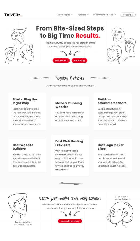
Minosh’s blog design from TalkBitz is something I admire a lot. The site just has a singular color which makes the CTA buttons pop up nicely.
Another great example of a simple, minimalistic and straightforward approach.
ELL FROM BOSS GIRL BLOGGERS
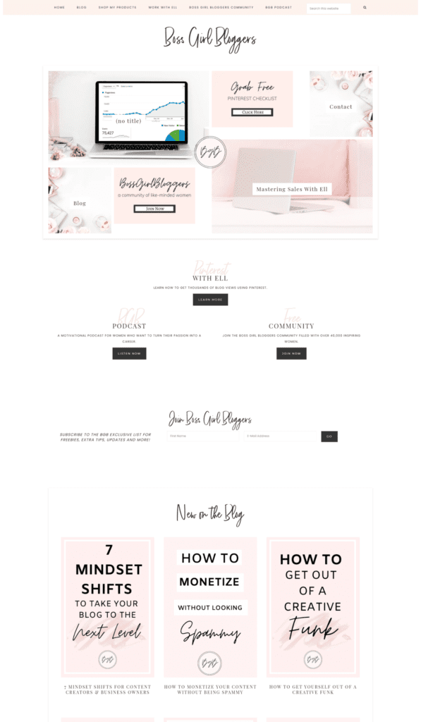
Ell’s blog from Boss Girl Bloggers is a great example of a feminine blog design. It gives off women solopreneur vibes which makes it match her niche and blog goal so well.
As you can see, the home page has multiple sections. Some sections contain freebies, some contain courses, blog posts, community, her podcast, etc.
This is one of my favorite website designs by a blogger in my niche. Absolutely breathtaking.
Now that we have discussed some great blog designs, let’s see how you can design your site like this too!
WHICH TOOLS TO USE TO START DESIGNING?
Before we move on to the next section, let’s discuss which tools you’ll need to design your blog.
Firstly, to design a blog, you must own a blog or a website. If you’re reading this guide then there can be 2 possible conditions:
- You haven’t started a blog yet.
- You have already launched your blog but thinking about rebranding it.
If you fall into the first category, my recommendation is to start a self-hosted blog on WordPress.org. Sure, there are many free platforms to blog on such as Wix, medium, blogger, WordPress.com etc. but if you’re serious about blogging and want to make a living out of it, then you must go for a self-hosted blog.
I recommend going for Hostinger as your hosting service because it’s very affordable and beginner-friendly. Heyy, my blog is also hosted by Hostinger and I’ve never been this happier with my hosting company.
You also get many free benefits such as a free business email and free domain for the first year which is the cherry on the top!
I have a full tutorial on how to start a self-hosted blog using Hostinger if you want to check it out!
Once you have purchased the domain and hosting for your site, the next step is to install WordPress (it’s free) and then install a plugin called Elementor. It’s a free plugin but you’ll find the good stuff in its pro version. I definitely recommend it!
Click here to try Elementor:
You must be wondering why Elementor when there are other website builders available. Because it offers what most website builders fail to provide: simplicity and efficiency.
I have tried many website builders to design websites but so far Elementor has taken the lead in everything. It’s a fast, responsive, easy to use, beginner-friendly, SEO-friendly, and easy to access page builder.
To summarize this section, you’ll need:
- A self-hosted WordPress site
- Elementor page builder
- A branding Kit (which I have provided here for free!)
If you fall into the second category, you may be thinking about rebranding your existing site. Just follow the instructions I have provided further. Use the free Branding Kit I have attached to this guide!
12 TIPS ON HOW TO DESIGN BLOG/WEBSITE TO IMPRESS YOUR READERS
Now that we have discussed what makes a website design good and which tools you’ll need for it, let’s move on to the next section.
Here we’ll discuss what you can do and how you can make your blog design shine to make your readers fall in love with it.
To summarise all the points, this is how to design blog/website in 12 simple steps:
- Choose a good theme
- Simple, clear and neat fonts
- Design the perfect header
- Anatomy of a Home Page
- Attractive Color palette
- Must have pages to design
- Overall optimization
- A simple and minimalist approach
- Easy to share with others
- Make use of the Sidebar
- Use visuals
- Don’t forget to make use of the footer
Let’s discuss each point in more detail.
1. CHOOSE A GOOD THEME
Before you start designing the pages of your site with a page builder like Elementor, you must have a base theme.
The theme matters a lot for the looks and functioning of a website. So, you must choose one very carefully.
There are free themes as well as paid themes you can install and use. I use the OceanWP theme for my blog because it’s clean, fast, simple and SEO friendly. Suits any niche too.
So, whichever theme you choose, make sure that:
- it suits your niche
- it looks clean and simple
- it’s fast and SEO friendly
- it’s compatible with important WordPress plugins
If your base theme is good then you can design an awesome website and customize it however you like.
Some themes that I recommend using are:
- OceanWP (free)
- Astra (free)
- Bluchic (paid)
- Kadence WP (free)
- 17th Avenue (paid)
- StudioPress (paid)
I have a full list of the best WordPress themes you can install for your blog. You can check it out to get more details about these themes.
2. SIMPLE, CLEAR AND NEAT FONTS
Fonts that are easy to read are ideal font choices for your blog. You must put a lot of thought into choosing a great font or font combinations.
I’ve tried and tested many different fonts myself too to finally choose one that works the best for my blog design. I gained knowledge about font combinations, types of fonts and font sizes while choosing one for my blog.
So, this is my advice to you when choosing a good font for your blog design:
- Make sure that the fonts are easy to read
- The fonts should reflect your personality and tone
- Don’t use too many font styles. Two different font styles are good!
- Make sure that the fonts are not too crumpled up into each other. Good spacing between letters and paragraphs matters a lot.
- Don’t go for fancy fonts even for headings. Keep it simple.
- The font size of 21 px is considered good.
- Use Google fonts because they are fast loading and easily accessible.
I’ve included 10 font combinations picked by me in the free branding kit I have provided here to make things easier for you. Enjoy!
3. DESIGN THE PERFECT HEADER
What makes a header perfect?
Let me explain.
The main function of the header is to help your audience navigate easily on your blog. If they are looking for something specific, they can find it on the header of your site.
There are some mandatory pages you must include in your header along with the logo of your blog:
- Home page
- Blog Page
- About page
- Contact page
HOW TO DESIGN A LOGO FOR YOUR BLOG
To design a logo, you’ll need a free designing tool called Canva. Follow these steps:
- Go to Canva and create a free account
- Click on ‘Create a design’ and type ‘logo’ in the search bar
- Canva will create a 500 x 500 px Canvas for you to start designing your logo
- Play around with some designs and after finalizing the design, download it.
That’s it! I’ve also included 6 different logo design Canva templates inside the branding kit so feel free to use them.
You must design two types of logos for your blog, one for the header or wherever else you want to use it and the other for the site favicon and footer.
Let’s get back to the header design now.
If you’re reading this then you: 1. may have some content available on your blog for your audience 2. just launched your blog
If you fall into the first category then you can add extra content in your header such as courses, freebies, guides, shop, services, etc.
If you just launched your blog then consider only including the pages I have mentioned above. You can always make changes to your header whenever you launch something new for your audience.
This is how the header of my blog looks like right now ↓

As you can see, I’ve included my blog logo on the very left side followed by the menu bar which contains some sub-menus nested inside it.
It’s simple and responsive, making it easier for my audience to navigate my site easily. I always make small tweaks here and there to improve it.
Keep in mind that it takes time to build the foundation of your blog.
4. ANATOMY OF A BLOG’S HOME PAGE
Designing a good home page for your blog is somewhat tricky. Some bloggers include a home page for their site and some don’t.
Should you?
My advice is yes! It’s beneficial to design and include a home page on your site because it comes with a lot of benefits. I mean it’s the main page of your website. Your audience will find it beneficial too.
But what makes a home page good and what should you include to make it more helpful for the readers? Let’s discuss.
Here’s the complete anatomy of your blog’s home page:
- Header: The first thing a person would most probably notice on your home page is the header of your blog. They’ll take a look at what your blog has to offer and what they can expect from you. Although the header is visible on every page of your site, the home page is where it pops the most.
- Introduction about you: If someone visits your blog, they want to know who’s behind this awesome site. For that, you can include a little introduction of yourself on the home page and tell people the purpose of your blog. It helps in building trust and credibility. You can also include your social media handles there.
- Email sign-up form: Do you have a freebie that you want to offer to people to build your email list? If yes, then attach a signup form for that freebie on the home page to gain even more exposure.
- Blog Posts: Yes! Your blog posts are one of the most important things to put out in front of your audience. So, include them on your home page.
- CTA to products: If you have products to sell on your blog, let your readers know about them by including them on your home page. Add some details with a button to redirect people to your shop, service, course, product, etc.
This is what I personally do to design the home page of my blog: I include everything that I have included in the header of my site.
You can do that too! Amazing, right?
5. ATTRACTIVE COLOR PALETTE
Your blog design is not complete without a good color scheme. This is where the real fun begins.
As someone who loves playing around with different design styles and color schemes, this part of blog design is the most interesting for me. Maybe for some of you too!
Choosing and following a consistent color palette leaves a positive impression on your audience. This makes your blog design more cohesive and easy to recognize.
You may recognize your favorite blogger just by seeing their brand’s color palette. Am I right? That’s how much following a color palette matters for your blog.
Most bloggers choose warm color palettes for their blog design to make it feel more welcoming. Some also use bright colors to create a cheerful vibe. Some go for vintage aesthetics, elegant colors, earthly colors, cool colors, whichever suits their brand the most.
You can choose whichever type of palette you like the most. You can get help from color palette generator tools like Coolors or Color Hunt too.
You can read this color theory as well to understand color palettes better.
6. MUST HAVE PAGES FOR BLOG DESIGN
Remember when we discussed which pages to include in your blog’s header? Exactly! Those are the essential pages you must create and design for your site.
Let’s discuss them once again but with more details:
- Home page: the main page of your blog from where readers can easily navigate through your site.
- Blog page: where your blog posts are stored for people to read content from. Make sure the blog page is well designed.
- About page: many people underestimate the ‘about’ page but it has the power to turn your readers into potential clients/customers so don’t ignore its design and functioning.
- Contact page: If someone wants to contact you for any queries, sponsorships, collaboration, etc. then they can easily contact you through a contact page. You can attach a form and your business email there.
- Resource page: A page where you can showcase all resources you use for blogging and content creation. Most bloggers (including me) use it for affiliate marketing purposes too.
Start working on these pages of your blog to build more credibility and trust in your audience.
7. OVERALL OPTIMIZATION
Okay! So far we are done with choosing a theme, font style, color palette, logo, and all the necessary pages for your blog.
But you can’t forget to do this one very important step for your blog: WEBSITE OPTIMIZATION
You must make sure that your website loads fast and looks good on every device because most people use mobile devices to visit websites nowadays.
Don’t make the mistake of sacrificing user experience to make your blog super fancy. If your website wouldn’t work well then all those branding efforts will go down the gutter.
To make sure your website loads fast, do the following:
- Use a fast loading theme
- Use a plugin called ‘smush’ to compress images with high resolution (for WordPress users only)
- Use standard fonts (Google fonts) because they are fast loading
- Don’t install too many plugins
- Don’t go overboard with animations
Just take care of these things and your site speed will be good!
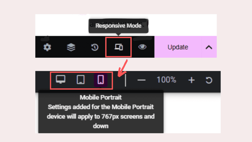
To make your website tablet and mobile friendly and optimized, you can use Elementor’s responsive mode and make the changes accordingly.
Here’s how ↓
8. A SIMPLE AND MINIMALIST APPROACH
Don’t go fancy. You aim to make your blog as user-friendly as possible so I recommend not to go for complex designs which will leave your readers clueless about what to do next.
Not only for designing fonts, animations or colors, I’m also talking about language simplicity.
If your audience is global then use simple words and terminologies. Don’t make it difficult for readers to understand what you’re offering with your blog.
It would be inconvenient for them to run to Google to find the meanings of different words each time they visit your blog. Think about it.
These are minor things that can ruin the user experience. Prioritize your audience. Don’t make things complex for them.
9. EASY TO SHARE WITH OTHERS
Make your posts easy to share!
Wouldn’t it be great if people can share your posts just by one click and you’ll get more eyes on your blog?
You can absolutely do that! By adding social share buttons on top of your every blog post.
There are many plugins available to do that. I use Hubbub social share buttons to make sharing possible on different platforms in just one tap.
You can also use other plugins like social warfare, sassy social share, addtoany social buttons, etc. Whichever works the best for you.
10. MAKE USE OF THE SIDEBAR
Your blog’s sidebar can be used for many different things:
- Short author bio
- Displaying blog posts
- Affiliate links
- Showcasing freebies
- Showcasing products, courses, services
- Your blog categories to give new readers some idea of your content
It gives more exposure to the extra content you offer on your blog to the readers which can help you convert more sales.
You can enable the sidebar on all pages of your site. I use my sidebar on the blog page and blog posts because they make the most sense there.
You can use them anywhere you want. That’s totally up to you.
11. USE VISUALS
Just using text everywhere on your blog would be boring so try to add images to make the blog design look more attractive.
Before using any image, make sure that:
- the image is copyright free. Use stock images.
- the images are of high resolution.
- the image size is not too large. Compress them using an image compressor tool to decrease the file size.
- the images suit your niche and branding.
One more thing: maintain the image text ratio nicely.
Don’t use too many images with less text and don’t use too much text and only a few images. That would look odd.
Use both of them in, not saying an equal ratio but a well maintained ratio. Don’t make them look odd.
12. DON’T FORGET FOOTER
Last but not least: the footer of your site.
But what to include there? Allow me to tell you.
You can include everything in your footer that you’ve added in your header: the logo, your site pages, search bar, social media handles, etc.
You should also include the three legal pages of your site in the footer: Privacy policy, terms and conditions and disclaimer.
You can create these legal pages using this tool called termsfeed.
Please don’t think people would not look at the footer because it’s at the very bottom of the page. They will look at it so make sure to use it properly.
These were all the design tips for your blog. I’ve compiled every information I possibly could in this single post so that you can build your blog easily.
Keep in mind that both the content and a good design matters for the success of your blog so work towards both of them.
And before you go, make sure to grab this free branding kit to brand or rebrand your blog in no time.

Bookmark this post for later!



Really appreciate your kind words! I love minimal designs, and it’s great to hear you admire it. Thanks for mentioning TalkBitz.com on your list!