Some nice blog posts you have there on your site but let me guess: Are you struggling to get more eyes on them?
This is the situation of every new blogger because Google doesn’t care about new sites at all. In recent years, the algorithm changes in search engines also made things much more difficult.

And now you’re scratching your head trying to figure out how to make things work.
I’ve been in this situation too so I looked at what other bloggers were doing and found the solution.
PINTEREST!!
I never knew Pinterest could be such a lifesaver for new bloggers. I wasn’t aware that you can use it to get traffic on your blog before I started blogging. (and I’m talking about a huge number, thousands per month!!)
Within 10 months of creating a Pinterest account, I gained almost 80k Pinterest monthly viewers with a 50k total audience.
Judging by the stats, you can tell my blog is getting more exposure because of Pinterest and you can do this too!!
How?
By designing alluring pins that would grab people’s attention.
Pinterest is a visual search engine and if your pin designs are bad, then no one will click on them and you won’t get any engagement.
No engagement means you won’t get any traffic at all.
You have to make sure your pins stand out and for that, you need to keep a lot of things in your mind.
You shouldn’t post on Pinterest just for the sake of uploading. That’s a big no no.
So in this detailed guide, I’ll tell you exactly how to design Pinterest pins so that people can’t resist clicking on them.

Ready? I’m sure you are! Let’s jump in!
Some links in this post are affiliate links. If you purchase through these links, I earn a commission at no extra cost to you. I only recommend products, tools and services that I trust. For more information, read the full disclosure here.
WHAT ARE THE 4 POPULAR TYPES OF PINS ON PINTEREST?
Pinterest is a search engine like Google, so it offers different content types. On Google, you can find content in various forms, such as blog posts, images, videos, etc.
The content you post on Pinterest is called ‘pins’ and just like Google can upload content (which are pins) there in different forms.
So what are these different pin types? Read below!
These are the 4 types of Pins on Pinterest:
- Image Pins
- Video Pins
- Rich Pins
- Product Pins
IMAGE PINS
Image pins are single-image static pins. You can design the pins using a tool such as Canva and then upload them on Pinterest.
They are the most common pin type on Pinterest.
VIDEO PINS
Video pins are dynamic pins. You can create dynamic pins by adding GIFs to image pins too.
Video pins seem to grab the audience’s attention more quickly than image pins.
RICH PINS
Now what the heck is a rich pin? (this was my reaction when I first heard about them)
Rich pins are advanced types of pins that collect data from your blog posts such as the title, description, author, etc.
If you’re using Pinterest to bring blog traffic (which we are doing for this guide) then you must use rich pins.
PRODUCT PINS
If you’re selling a product on your site, you can use product pins to direct your potential customers to the product page.
Product pins are a type of rich pins.
They provide more information about the product you’re selling and promoting.
THE ANATOMY OF A NICELY DESIGNED PINTEREST PIN
Let me share my experience when I was completely new to this whole Pinterest blog traffic concept.
I was clueless. Everything was new to me. Maybe you’re experiencing this right now so I can totally relate.
I opened Canva and created a custom design of dimensions 500 x 500 px (do not make this mistake, this is wrong). I designed it with a very weird color combination and uploaded it (I deleted it now).
It was basically a mess and I continued to design my pins like this for probably 2-3 weeks.
I made many mistakes and learned from them. Now, I can say that I’m very confident with my Pinterest promotion strategies.
So, the question is: What makes a pin design great that grabs people’s attention?
During my Pinterest marketing learning journey, I gathered and noticed a lot of information on what makes a pin design stand out. I was a dummy when it came to designing pins.
I observed what makes the pin design so attention-grabbing that it gets thousands of clicks in a short amount of time.
I tried and tested different designs, fonts, and color combinations and eventually learned about great design techniques.
It took me a lot of time to figure this out…….and I finally came up with the following observations.
Here’s the anatomy ↓
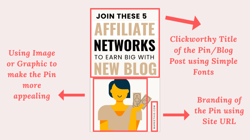
What makes this pin great is its 5 main elements:
- Clickworthy title
- Simple and clear fonts
- Branding
- Great color combinations
- A graphic or an image
You can tell that people would click on this pin because it’s nicely designed. This is how much the design of a pin matters!
You can also create some nice pin designs like this very easily using free tools such as Canva.
We’ll discuss these points along with other important details in the next section.
HOW TO DESIGN PINTEREST PINS THAT LOOK ABSOLUTELY BREATHTAKING
I learned a lot from my Pinterest promotion journey. I made mistakes, a lot of them and from all those experiences, I have compiled a list of some awesome design tips for your pins.
Here are some tips on how to design Pinterest pins that people can’t ignore whenever it comes on their feed.
- Use Vertical Pins
- Clear and Simple fonts
- Great Quality images
- Right color combinations
- Branding
- Maintain image-text ratio
- Add Call to Action
Let’s talk about the correct dimensions of a Pinterest pin which takes us to the first tip.
TIP 1: USE VERTICAL PINS
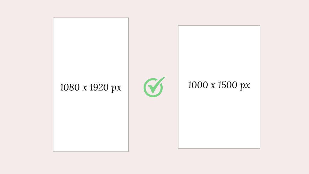
The most recommended dimensions of Pinterest pins are:
- Standard pins: 1000 x 1500 px
- Long Pins: 1080 x 1920 px
Why is it recommended to use vertical pins? Allow me to explain!
The reason is pretty simple: Vertical pins give you more space to design and add more elements. High-quality vertical pins also stand out in people’s feeds.
So if you really want people to click on your pins then design your pins in this ratio ↓
And not this ↓
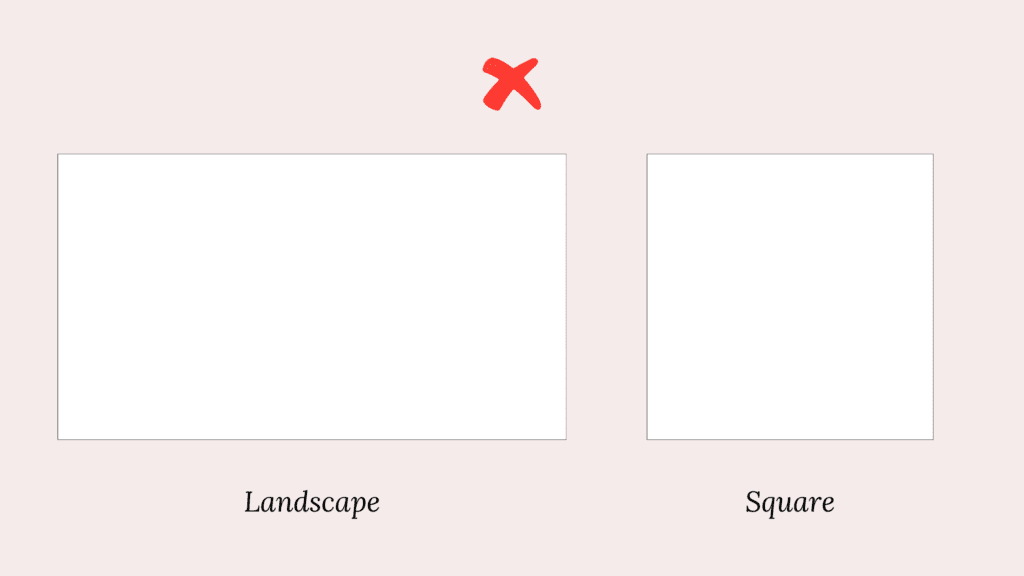
Using the correct size of pins is more important than you think. Pinterest likes vertical pins too so it’s also great for SEO purposes.
TIP 2: CLEAR AND SIMPLE FONTS
Please use simple, neat and easy to read fonts while designing your pins.
I see a lot of beginners make the mistake of using too fancy fonts which are difficult to make out.
Yes! Pinterest is a visual platform and it somewhat makes sense to use fancy and decorative stuff but you should not neglect user experience to make your pins visually attractive.
I recommend not using the fancy script and cursive fonts too much. They look good and fancy but are quite difficult to read.
Take a look at the pin I’ve shown above. The fonts I’ve used there are simple, clean and so simple to read. Looks perfect!
Keep in mind that the title you write on your pins is the main thing people would notice and then decide whether to read your blog post or not.
If your titles are messy, the chances of people visiting your blog would be very low. (You may end up getting no traffic at all 😥)
Some fonts I would recommend going with are League Spartan, Futura, Montserrat, Lovelo, Apricots, Oswald, Glacial Indifference etc.
Otherwise you can also check out this list of the best Canva Fonts for your pins.
TIP 3: USE HIGH QUALITY IMAGES
Because no one likes blurry, pixelated images. This could leave a bad impression and unprofessionalism on your audience.
Canva has a huge library where you can find both free and premium high quality images and videos.
You can search for an image that matches your blog title and you’ll get a lot of options to choose from. Click on the image or drag and drop it on the canvas to start designing.
It’s that simple!
An alternative option is to download stock images from a third party platform such as Pexels or Unsplash. You can use copyright-free images from any of these platforms of your choice.
Just make sure that the image is of high resolution and matches your niche (you cannot use food related images for a tech niche 🙂)
TIP 4: RIGHT COLOR COMBINATIONS
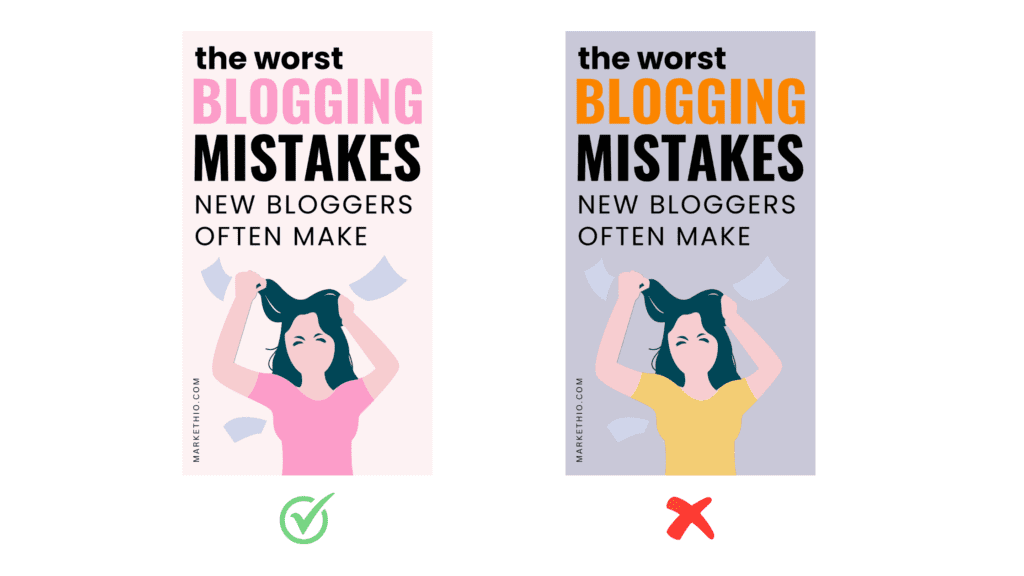
Colors are the main charm of your pins so you have to think carefully about which color combinations to use.
You can take inspiration from other people in your niche and see which colors they are using to design their pins.
Pro Tip: Canva has an amazing feature of extracting the colors of an image. You can use the same color combinations for the fonts and background as the image. Look at this pin I designed using the same technique.
This creates a monotony in the design of the pin and makes them look more beautiful. Amazing, isn’t it?
I recommend trying out different color combinations other than your blog brand colors. I mean it’s amazing to stick to your blog branding but in the case of Pinterest, it’s better to work with different styles.
I also used to create pins based on my blog brand colors then I realized that I should probably test out different designs and colors.
And guess what?
Ever since I made this change, my Pinterest analytics has gone uphill. It makes a lot of different guys!!!
Make sure to choose colors wisely. You can also get help from tools like ColorHunt to choose nice combinations for your pins.
Look how much difference it makes to use the right color combinations for your pin designs:
TIP 5: BRAND YOUR PINS
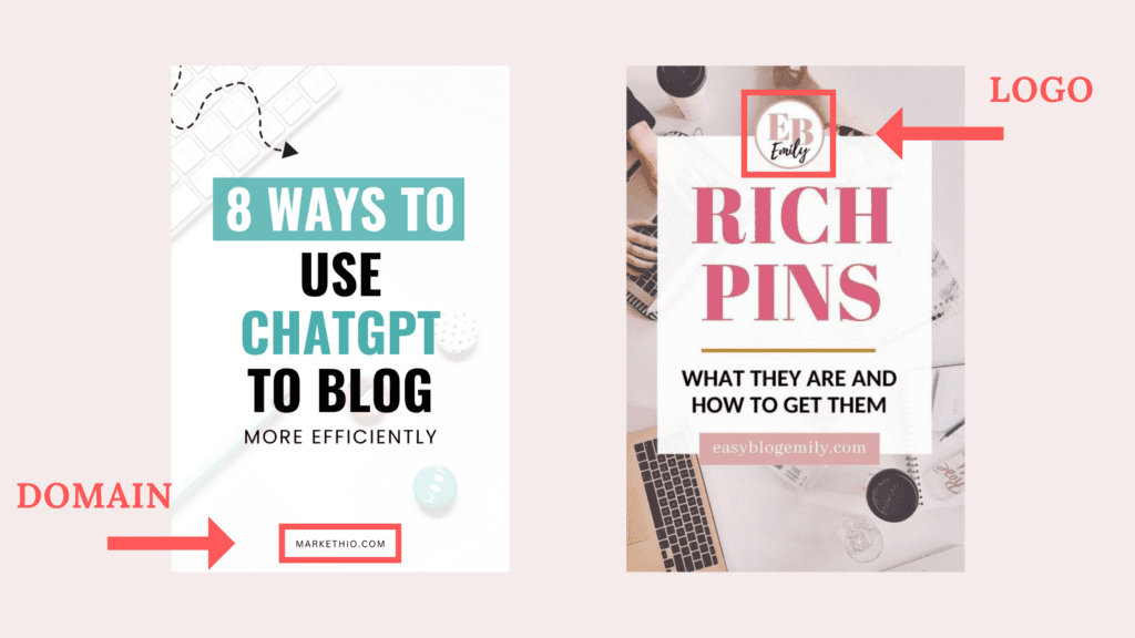
This is a very important element to add to your pins: your blog logo or domain name.
You can add a little text of your blog domain name at the bottom of your pin like this: [yourblogname.com]
This way your audience can identify your pins easily and you can protect your pins from getting stolen.
Adding a logo or domain name to your pin design makes it your property and prohibits others from reusing it.
You can add them like this:
TIP 6: MAINTAIN IMAGE TEXT RATIO PROPERLY
This is a minor tweak you should do to make your pins more appealing. Use the correct image text ratio!
You may be wondering: ‘What does she mean by the correct image text ratio?’.
Let me spill.
To make your pin design even greater, you should utilize the space for the text and the image in the right way.
This doesn’t have anything to do with mathematical ratios by the way.
To put it simply, your images shouldn’t be too big to make the text unnoticeable and the text shouldn’t be too big to take up the entire space of the pin.
Here’s an illustration of this ↓
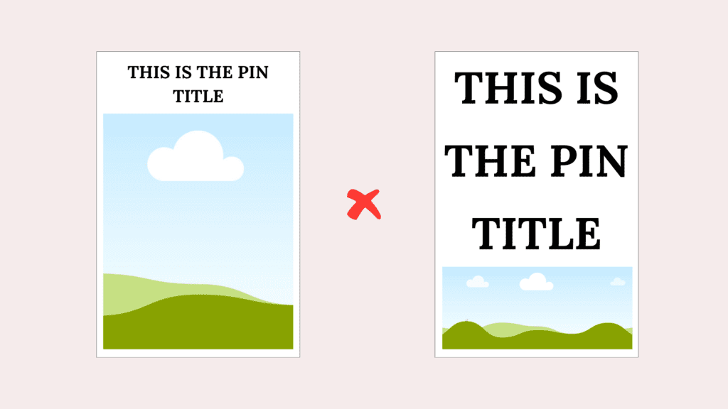
The above pin designs look odd, don’t they? The ratio doesn’t quite match up. So avoid these design techniques.
A very popular pin design that has the correct image text ratio looks like this (below). You may have seen this design a lot on your Pinterest feed because it has the perfect ratio.

So keep this in your mind while designing your pins 😉
TIP 7: ADD CALL TO ACTION
Adding a CTA in your pin design that says ‘click here to download’ or ‘click here to know more’ encourages people to visit your blog posts.
Using words like ‘click here to download’ or ‘click for more details’ will encourage readers to visit your blog posts.
On mobile devices, if someone clicks on your pins, they will be directed to your blog post which you have linked to that pin.
That’s amazing because Pinterest is one of the few platforms that encourages readers to leave its own platform. This is one of the reasons why Pinterest is so powerful for marketing purposes!
There’s no need to add a CTA to every pin. Just use it wherever you can to make it feel natural. The CTA works great to bring more eyes to freebies and digital products.
DESIGNED THE PINS! WHAT’S NEXT?
Post them!
Go to your Pinterest profile, click on the hamburger icon and then create a pin.
But wait! While publishing your pins, you have to keep in mind other things as well:
- Optimize your Pin title by using relevant keywords in it
- Optimize the pin description by using relevant keywords in it too. No need to use hashtags.
- Don’t create pins of the same link over and over again otherwise you’ll get caught in the Pinterest spam filter. I recommend creating 2 pins per day of different URLs if you don’t have much content on your site.
- Optimize your Pinterest board’s title and description with relevant keywords.
- Claim your website to stand out on the Pinterest home feed.
Here are some detailed guides on Pinterest that I suggest reading:
- How to find Keywords for your Pinterest pins
- How to optimize your Pinterest profile to grow blog traffic
DON’T FALL FOR THESE MYTHS ABOUT PINTEREST
There are a lot of things you need to know about Pinterest when you’re just starting.
While most of the information you’ll find on the internet is true, it is easy to believe some common myths as a beginner.
So I’ll debunk the 2 most common Pinterest myths for you!
#1 YOU’LL NEED TO POST 10-20 PINS PER DAY
That is not true.
Pinterest has changed over the past few years and I still see many articles that recommend posting 10+ or even 20+ pins per day.
Don’t do that.
First of all, creating this many pins per day will completely drain you out and you’ll lose motivation to move forward.
Secondly, creating this many pins every single day is pretty much impossible. You have to do other things as well!
Lastly, Pinterest prefers quality over quantity. It’s much better to post 4-5 high quality pins per day rather than 20+ average pins.
I post 5 or 6 pins daily and my Pinterest growth is doing really well!
Quality >>> Quantity
#2 YOU’LL NEED A LOT OF FOLLOWERS TO GET A GOOD AMOUNT OF TRAFFIC
Followers on Pinterest don’t matter. Why?
Because it’s a search engine, not a social media platform. Having a lot of followers on social media matters a lot to gain exposure to your blog but this is not the case for Pinterest.
You can bring a huge chunk of traffic to your blog through Pinterest without having hundreds or thousands of followers.
You just need to work on the SEO part and create great pins (which I’ve taught you in this guide).
Phew! We’ve reached the end of this post.
Now that you know how to design Pinterest pins to bring traffic to your blog, it’s time to start working on it.
If you’re a busy bee who doesn’t have much time to design pins then I have something just for you!
These are 35 pre-designed customizable Pinterest templates that I have designed myself, especially for beginners like you to create stunning pins in no time.
Grab your templates here ↓

Pinterest Graphic Canva Template
These beautiful 1000 x 1500 pixel Pinterest Canva templates are perfect for bloggers, marketers, and content creators to drive traffic and enhance engagement. Customize easily, save time, and build an audience on Pinterest.
Bookmark this post for later!
